
Concept refinement for Casaus Insurance Group, prepared by She Thrives Marketing. View the full concept Proposal

Casaus Insurance Group LLC CasausInsurance Group (615) 549-5756

Side by side

What changed, and why

The existing site is well built. The structure, the black and gold, the serif headlines are all working. What follows are six specific changes, one of which is an outright bug on phones.

Page
Screen

Live site today

Before
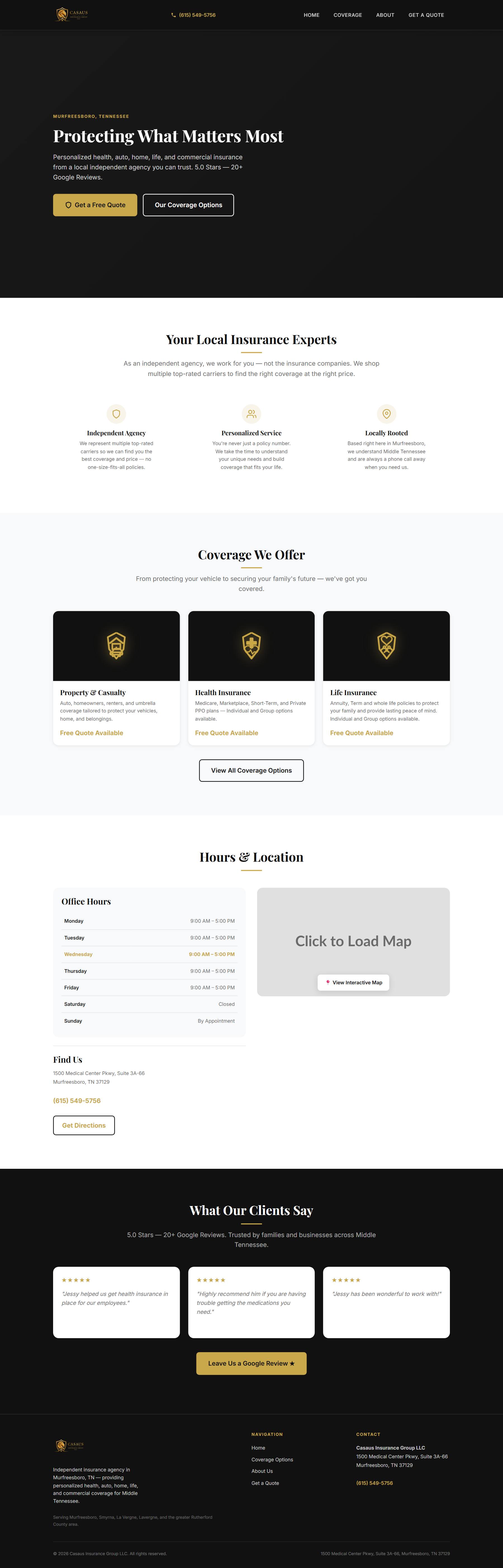
The current Casaus Insurance Group homepage

Proposed

After
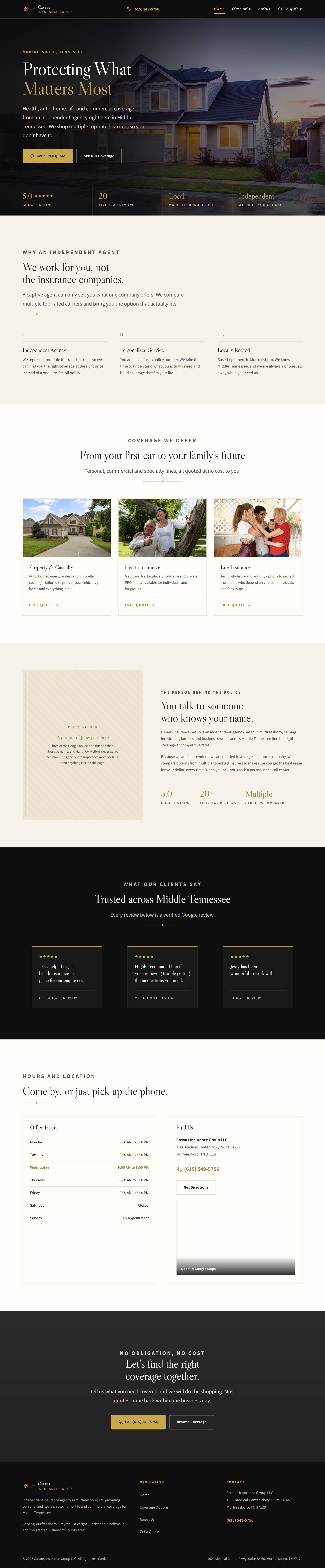
The proposed Casaus Insurance Group homepage

Both panels scroll. Switch to Phone on the Coverage page to see the layout problem.

The list

Six changes, worst first

I.
Bug, not a preference

The coverage page breaks on phones

All eleven coverage cards keep their desktop side-by-side layout at phone width. The copy gets squeezed into roughly 45% of the screen while the "Get a Quote" button floats next to it, so every card becomes a tall narrow ribbon of ragged text. "Property & Casualty" splits across two lines.

This is the page that drives quote requests, on the device most people are using. It is a single media query. Fix this one regardless of what else you decide.
II.

There are no photographs on the site

Every image on the live site is either the logo, one of three icon files, or a grey box standing in for the map. That is why the homepage opens on a black rectangle with text in the left third and nothing else.

It does not read as elegant restraint. It reads as unfinished. The concept puts a real photograph behind the headline, which fills the space and sets a tone at the same time.

III.

Nobody can see Jessy

Three of the Google reviews on the site thank Jessy by name. There is not one photograph of him, the office, or a client anywhere across four pages.

Insurance from an independent local agent is a trust purchase. People are choosing a person over an 800 number, and the site never shows them the person. The concept adds a section built around his portrait.

IV.

The type is too small for who is buying

Body copy on the live site runs at 14px through most pages, and the FAQ headings drop to 16px, barely distinguishable from the text around them.

The products here are Medicare, life insurance and annuities. That audience skews well past sixty. The concept sets body copy at 18px and scales headings up to match.

V.

The best asset is buried in a sentence

"5.0 Stars, 20+ Google Reviews" is the single most persuasive thing on the site, and it sits at the tail end of the hero paragraph after a comma.

The concept pulls it out into its own row across the base of the hero, with the stars actually drawn. The same rating is also added to the page's structured data, along with FAQ markup for the six questions on the coverage page, so Google can show them as rich results. Neither is marked up today.

VI.

Two details that cost credibility

The map is a grey box reading "Click to Load Interactive Map," served from a third-party placeholder service. It is a deliberate speed choice, but it looks like the developer never came back to finish it. The concept uses a real static map that opens Google Maps when tapped.

On the About page, the third statistic is an infinity symbol labelled "Carriers Compared." It reads as filler. Better to use a real number or show only two.

Two things we need from you

Neither one takes long

One good photograph of you

A headshot or a natural shot at the office. This is the single highest-value thing on the list, and it is the one piece nobody but you can supply. Photos of the office and of Murfreesboro would help too, but the portrait matters most.

A test run through your quote form

The form on the live site is genuinely well built. It validates properly, strips unsafe input, uses reCAPTCHA, and shows your phone number if anything fails. It sends to a Google Apps Script.

What it does not have is any monitoring. If that script is ever redeployed the address changes and quote requests would stop arriving with nothing to warn you. Worth submitting one test and confirming it lands.

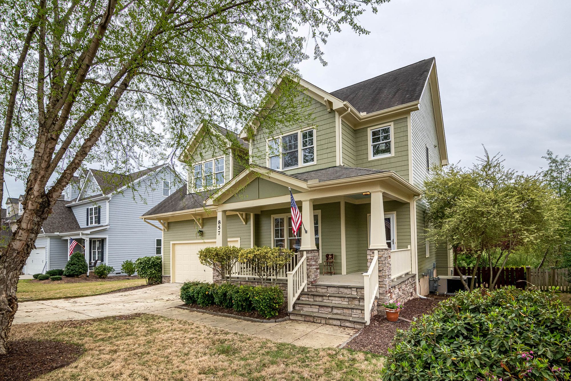
A craftsman-style family home with a covered front porch

What it would cost to build

One page, no surprises. The concept is also live and clickable if you would rather keep looking first.